I haven't posted on here for such a long time initially due to internet problems getting me out of sync, then christmas only adding to this, but at least I have done a substantial amount of work since last.
I continued to progress in creating posters of my own; finishing responses to the Cuban designer Reborio, and the soviet Stenberg Brothers, as well as an illustrated poster in response to Bob Peak, and a photoshop response to Saul Bass. Two more posters are currently under development also: a Bill Gold (more specifically 'Barry Lyndon' (1971)) inspired piece, and a hand drawn response to Reynold Brown.
I have recently condensed my research to create the content for my book. I tried to include general information about the film industry, a little about design and social issues, and finish with a summary of poster art in the era. This text is currently being proof read by my supervisor.
22/01/2010
24/11/2009
Reborio: The Complete Response
The first artist I chose to respond to was Cuban revolutionist designer; Reborio, and here is the final outcome of my experimentations, inspired by his work.

My main influence came from his poster for Moby Dick (1967), in which a focal image for the film- a whales tale- is placed infront of a psychedellic sunburst background, and filled with text. You can see the similarities in my work as I placed a focal image for my film concept- the gun- in the center of the composition, infront of a bright, sunburst background. I used a simple black outline and white fill to create the gun image, then filled it with colourful type, which is manipulated in size and angle to enhance the psychedellia. Looking through some of Reborio's other works I took elements from them to apply to my own. I used stripes in the background, a green border, and a pop art colour scheme.

My main influence came from his poster for Moby Dick (1967), in which a focal image for the film- a whales tale- is placed infront of a psychedellic sunburst background, and filled with text. You can see the similarities in my work as I placed a focal image for my film concept- the gun- in the center of the composition, infront of a bright, sunburst background. I used a simple black outline and white fill to create the gun image, then filled it with colourful type, which is manipulated in size and angle to enhance the psychedellia. Looking through some of Reborio's other works I took elements from them to apply to my own. I used stripes in the background, a green border, and a pop art colour scheme.
17/11/2009
Reynold Brown Response: Initial Design

The majority of Brown's posters feature extravagent, 'Come and see!' advertisments, with compostitions using star power, and sex, to sell the films. For this reason I aimed to create a simple composition which could be illustrated in a realist way, with 'wow' taglines. I have used the same images throughout my initial designs, but when developing them further will use appropriate stars to the era, and hopefull take some of my own images.
Reborio response: Initial design


In photoshop once again I have created a rough idea of how I will respond to one of my artists. Reborio, a Cuban revolutionary artist, has a fantastic style that i am looking forward to recreating in my own poster. I tried to incorporate elements of pop art, as Reborio did, by using bright, psychedellic colours. I wanted the piece to idolise the gun and hence have it surounded by a sun ray effect. I translated 'Bully' into spanish to enhance the Cuban origin, and found an appropriate font, though I think I may draw this myself to create a more psychedelic atmosphere.
Stenberg Brothers response: Initial Design
MY RESPONSE: STENBERG POSTERS:

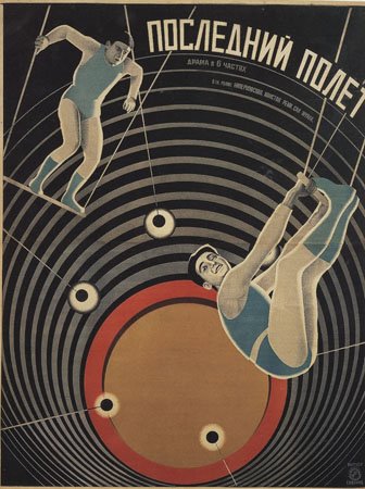


I tried to recreate a sense of constructivist style in photoshop, in order to have a starting point for a Stenberg brothers response. I began by creating a Stenberg brothers inspired background, using strong curves, like in the 'The Last Flight.' I then translated 'Bully' into russian, to enhance the soviet look, and placed this on the diagonal, a technique which has appeared in many of their posters. Using a couple of images from the film on top of this background, I aim to create an idea of the narrative, and further incorporate Stenberg style through coloured potraits.
Saul Bass response: Initial Design


Here I have created a simple photoshop composition to illustrate my idea of how to respond to Saul Bass. I used the Bass formula: an inconic, black shape, a bright, shaped background, and jagged typography. Although this desing is very rough, I think it serves as a initial starting point well.
10/11/2009
Film Concept...
I have come up with my film idea and now feel that is simple enough to be manipulated to the context, but solid enough for me to design individual posters. I have created a document which explains how I will respond to particular artists using this concept- a simple overview to help me begin experimenting.
Title: BULLY
Genre: CRIME (Film-Noir, thriller)
Plot: A man who was bullied as a child has suffered a breakdown and begins to travel round killing “bullies” in ways representative of his past. Meanwhile a team of detectives are hot on his trail picking up bizarre clues which make the case ever more complex and deadly.
Influences: SEVEN, USUAL SUSPECTS, SILENCE OF THE LAMBS
Poster features:
Title (the reccuring factor)
Star names (change over time, suited to the era)
Tagline (change depending on social events of the era)
Responses:
SAUL BASS: One thing unique to Bass is his use of an iconic shape. I have chosen to use a revolver silhouette (see Mean Streets) as in my prior research I found the gun symbol to be the most common motif in the crime genre. I would also like this gun to be smoking at the barrel, as to create an iconic symbol for the film. Bass has a distinctive, jagged typeface, which I shall also apply to the poster. Many of Bass’s pieces, and in fact many from the 1950’s, use bright colours to contrast with stark blacks. For this reason I will experiment with different colours and shapes in the background.
STENBERG BROTHERS: The constructivist style of the Stenberg’s is an interesting technique, which I will try and apply to my poster. Constructivism involves using existing images and reconstructing them in a new manner. To incorporate their style, as well as the crime genre, I would like to collect some appropriate images to reconstruct (a gun, a police badge) and also some kind of coloured portrait photo, which appears in many of their pieces. I would also like to include geometric shapes in the background, and a soviet theme.
REYNOLD BROWN: The main thing I need to incorporate into a Brown response is a realist portrait. Most of his pieces included a detailed painting of the films’ star, often depicted some thematic pose relevant to a major scene in the film. For this reason I have chosen to portray a detective (Bogart) who serves as the main selling point for the film and is dressed in conventional costume to the genre, and is holding the gun. Often Brown’s posters featured some sexual interest, therefore I believe I should include a helpless woman, who appears in need of rescue by the male star. In terms of composition Brown, and most 1950’s designers, chose to feature montage scenes combining different elements of the film.
BOB PEAK: Peak’s posters from the 1960’s have a distinctive feel to them. They feature a bright painterly composition, which pastes together a selection of images from the film, giving us a broad picture of the film as opposed to one scene in particular, or just a star image. These compositions use a painted background, with prominent brush marks, and pen illustrations on top. For this I would like to include the detective character (Paul Newman) as the films heart, he is to be placed central in the piece with the other elements of the film surrounding him. Again I would like this character to be in the traditional costume for the genre, and be holding the gun. Because of the cultural background to Peak’s work, I would like this poster to incorporate a sense of change and revolution, taking elements of pop art into account. For example I will use brighter colours than expected in the genre, subverting the standard, blacks and red.
REBORIO: This Cuban revolutionary artist has a fantastic pop art style. His pieces are fantastically abstract and feature an array of psychedelic colours. I think I would like to incorporate the revolver symbol from my earlier ideas as it is an easily applicable shape, and I feel would work well in a psychedelic image. This will be drawn simply with a thick black line and may even house the typography of the poster. Surrounding this I would like to include a bold, bright sun ray effect, to create the idea that the gun is not a dark dangerous tool, but almost holy, and idolised during revolutionary times.
RICHARD AMSEL: Amsel’s posters are realist illustrations depicting characters and important elements from the films. They have no real sense of hidden message, they are simply illustrations to sell the film. I think I will respond to Amsel last once I have a collection of images and ideas of scenes and then incorporate them in a traditional montage.
Subscribe to:
Posts (Atom)